
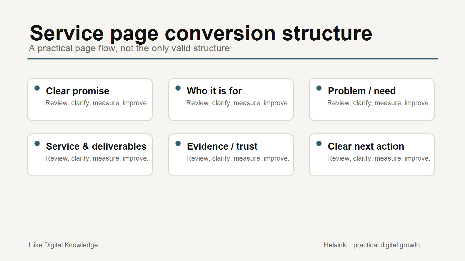
A service page can receive visitors and still fail commercially. Traffic only proves that people reached the page. It does not prove that the page helped the right person understand the offer, trust the business or take the next useful action.
For a small business, improving a service page starts with one practical question: what decision should this page help a suitable visitor make? Once that is clear, the page can be reviewed as a conversion path rather than a brochure.
Define the page's primary conversion goal
A service page should not ask for every possible action at once. Decide whether the main goal is an enquiry, booking, call, purchase, download or qualified consultation request. Secondary links can still exist, but they should not compete with the primary decision.
This also makes measurement clearer. If the page exists to generate enquiries, review enquiry starts, completed forms, calls, bookings and qualified follow-up conversations. Page views alone are not enough.
Clarify who the service is for
Visitors decide quickly whether a page is relevant. The opening section should make the audience and situation understandable: who the service helps, what problem or opportunity it addresses, and what type of outcome the customer can reasonably expect.
A vague promise such as "professional solutions for your business" forces the visitor to interpret too much. A clearer page names the customer context, the service scope and the next step.
Improve the headline and opening section
The first screen should answer three questions: what is this service, who is it for, and why should the visitor continue? This does not mean the page needs a long introduction. It means the headline, supporting text and first call to action should work together.
Google's search guidance consistently points businesses toward helpful, accessible content. That principle is useful for conversion too: if a search engine can find the page but a customer cannot understand it, the page is unfinished.
Explain scope and deliverables
Many service pages fail because the visitor cannot tell what is included. Explain the process, deliverables, timeline, inputs required from the customer and what is not included where that reduces confusion. This is especially important for professional services, digital services and advisory work where the output may not be a physical product.
Clear scope reduces uncertainty. It also helps prevent low-fit enquiries because visitors can self-select before contacting the business.
Use evidence and trust signals appropriately
Trust signals should support the decision, not decorate the page. Useful evidence may include case examples, client types, certifications, process explanations, reviews, business identity, policies, contact details, portfolio examples or clearly described experience.
Do not overclaim. A page is stronger when evidence is specific and believable than when it relies on broad claims such as "best" or "industry-leading" without support.
Make the next action clear
A good call to action tells the visitor what happens next. "Submit" is less helpful than "Request a service review" or "Book a consultation" when that is the real action. The button label, surrounding text and form should set expectations about response, preparation and follow-up.
Remove competing actions where they distract from the main decision. A visitor who is ready to enquire should not have to choose between five equally prominent buttons.
Reduce form friction
Forms should ask for enough information to continue the conversation, but not so much that the visitor abandons the process. Separate required from optional fields, use clear labels, avoid unnecessary account creation, and make error messages easy to fix.
Mobile usability matters here. A form that feels acceptable on desktop may be awkward on a phone if fields are too small, labels disappear, or the keyboard makes the page difficult to use.
Check performance and mobile experience
Page speed, responsiveness and visual stability affect user experience. Google's Core Web Vitals guidance focuses on loading performance, responsiveness and visual stability. For service pages, these are not just technical metrics. They affect whether a visitor can read, compare and act without frustration.
Review the page on a real phone. Check the headline, first CTA, form, tap targets, image loading and whether important text is hidden too far down the page.
Measure before and after changes
Before editing, record the current state: traffic source, landing page visits, form starts, form completions, calls, bookings, key events and qualified outcomes where available. Google Analytics and Search Console measure different parts of the journey, so use each for the right purpose. Search Console helps with search visibility before the visit; Analytics helps with behavior after arrival.
After changes, compare patterns over enough time to avoid reacting to one unusual day. Not every metric needs to improve at once. The useful question is whether the page produces more of the right actions from the right visitors.
Service Page Review Checklist
- The page has one clear primary conversion goal.
- The headline explains the service in plain language.
- The first section makes the audience and value proposition clear.
- The page explains the problem or need the service helps with.
- Scope, deliverables and process are visible before the CTA feels premature.
- Trust signals are specific, relevant and believable.
- The CTA label explains the next action.
- Competing actions are reduced or visually deprioritised.
- The form only asks for information needed at this stage.
- The mobile version is readable, fast and easy to use.
- Performance issues and layout shifts have been reviewed.
- Measurement includes business actions, not only traffic.
Conclusion
A service page converts better when it reduces uncertainty. The visitor should understand what the service is, whether it is relevant, what is included, why the business is credible and what happens next.
Traffic matters, but traffic without a clear decision path is unfinished marketing. Improve the page as a customer journey, then measure whether the right actions become easier.
Sources and further reading
- Google Search Central: SEO Starter Guide
- Google Search Central: Using Search Console and Google Analytics data for SEO
- Google Search Central: Understanding Core Web Vitals and Google search results
- web.dev: Learn forms
- Nielsen Norman Group: 10 usability heuristics for user interface design
Related Knowledge
- How to Turn Your Website Into a Conversion System
- How to Choose the Right Marketing Channel
- How AI Answers Use Website Content
- A Practical SEO Checklist for Better Search Visibility
Want to review your website more clearly?
Liike Growth System Workspace provides self-service website, SEO, visibility, reporting, briefing and account tools. It can help you review signals and prepare better decisions, but it does not automatically fix conversion problems for you.